Over the years, I've been asked to draw a lot of Didot-like designs. It seemed that every magazine art director absolutely had to have their own version of the design.
Remembering Photo-Lettering’s wonderful "One Line Manual of Styles", which showed page after page of Didot and Bodoni types, all drawn by the great NYC lettering artists of the 50s and 60s, I decide that I would create my own large collection of Didones.
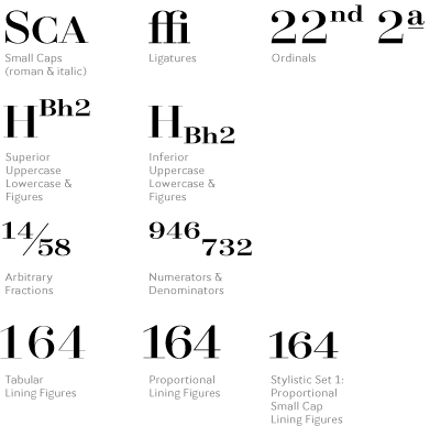
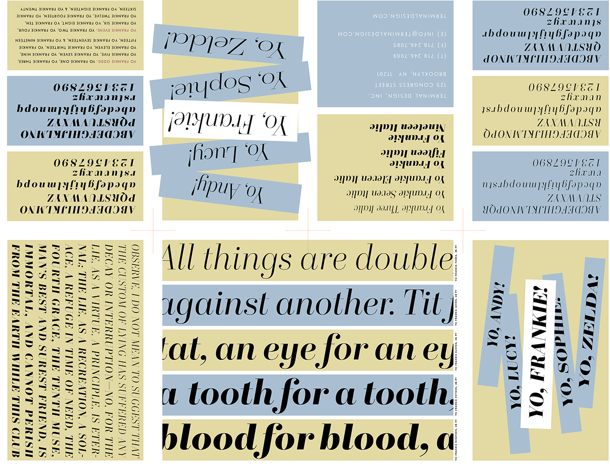
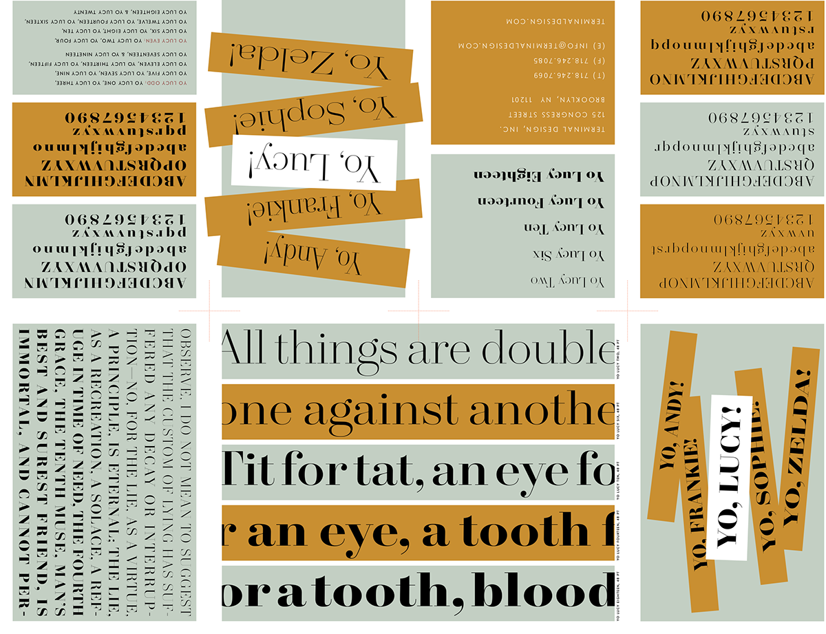
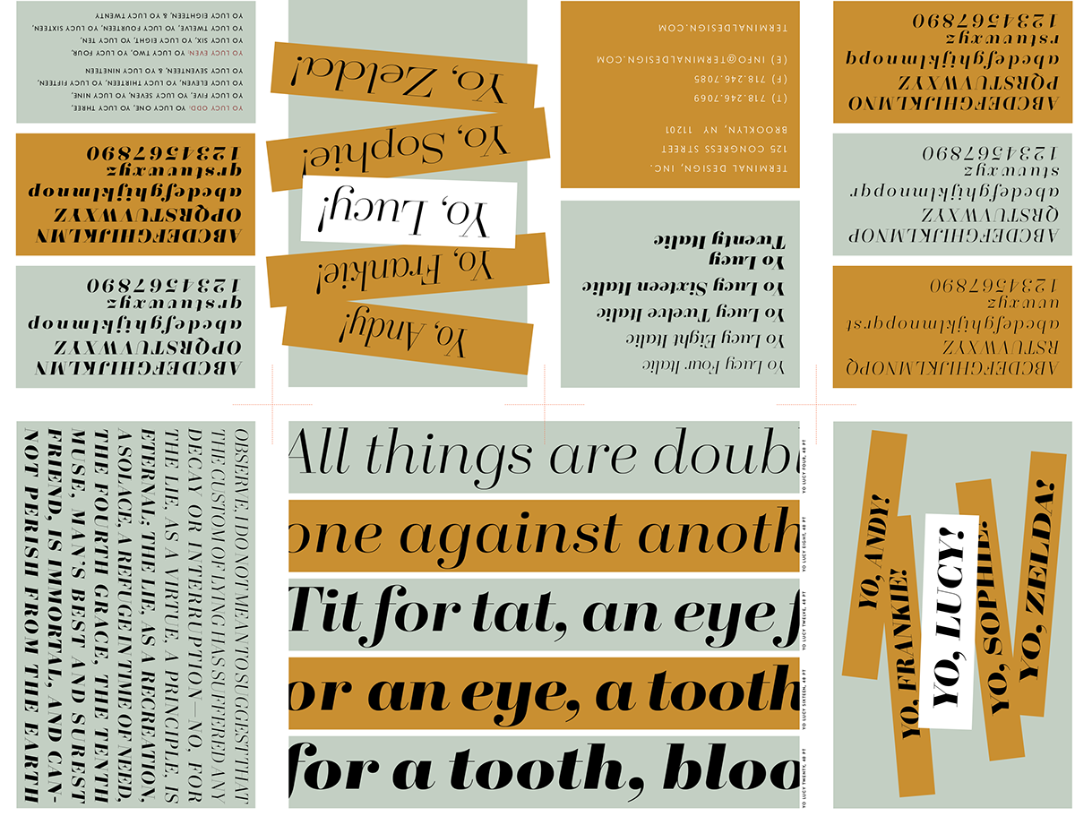
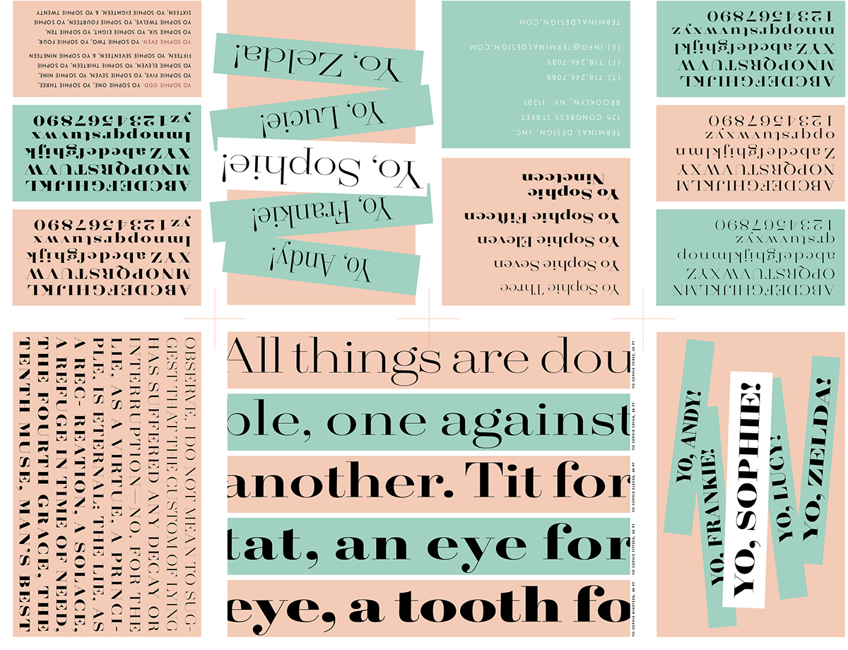
The Yo family was originally planned to have 26 widths each with 20 weights, 520 different fonts. Sanity forced me to scale my ambitions back to a 100 font family. I gave them all names to keep them straight in my head. A name beginning with the letter A would be the narrowest and Z the widest. So you have Yo Andy and Yo Zelda at the extremes. Yo Lucy in the middle, and Yo Frankie and Yo Sophie where you would expect them to be.
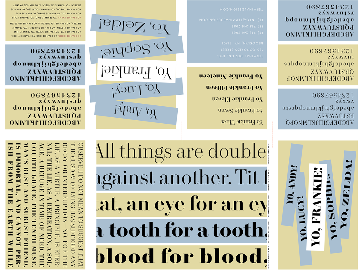
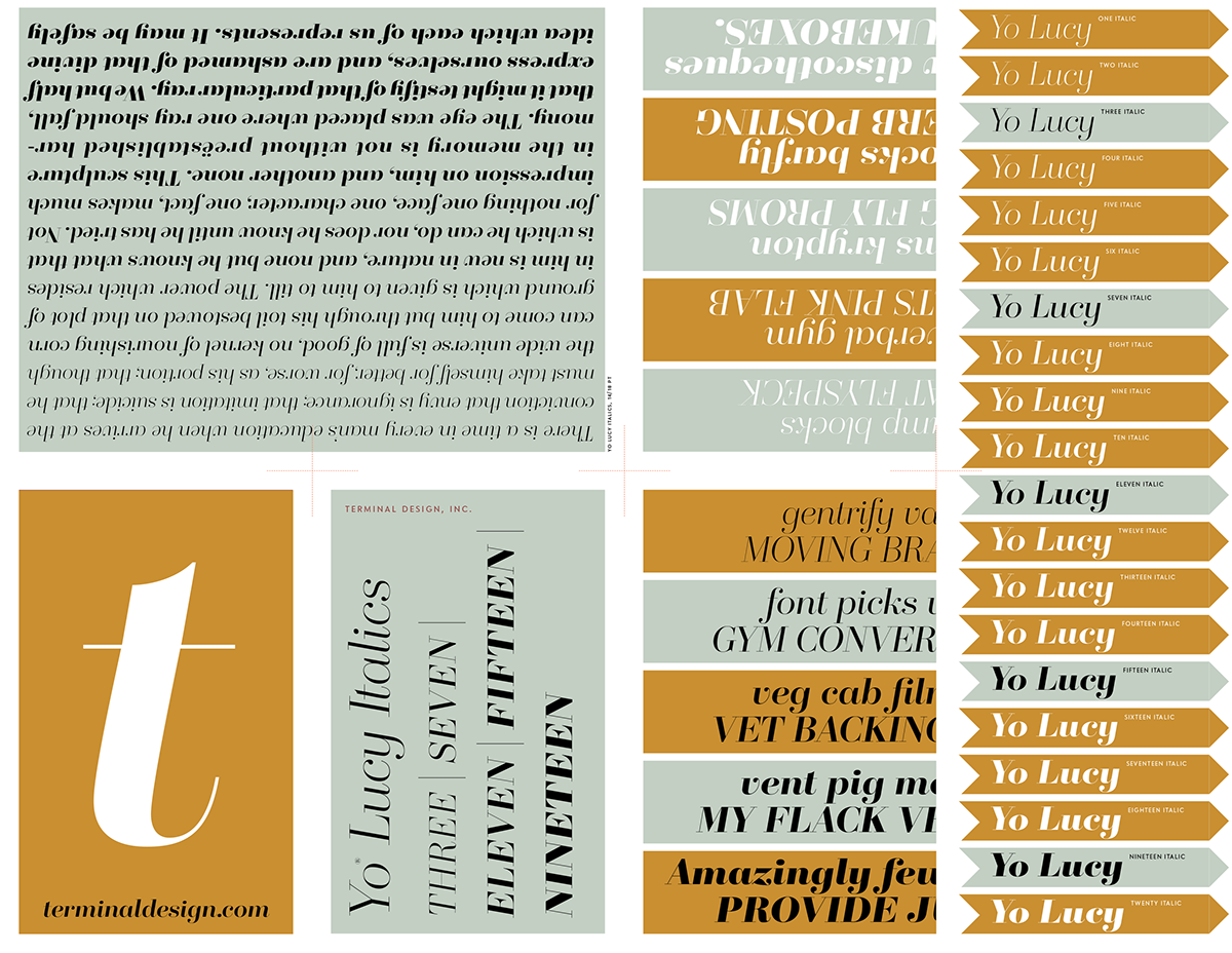
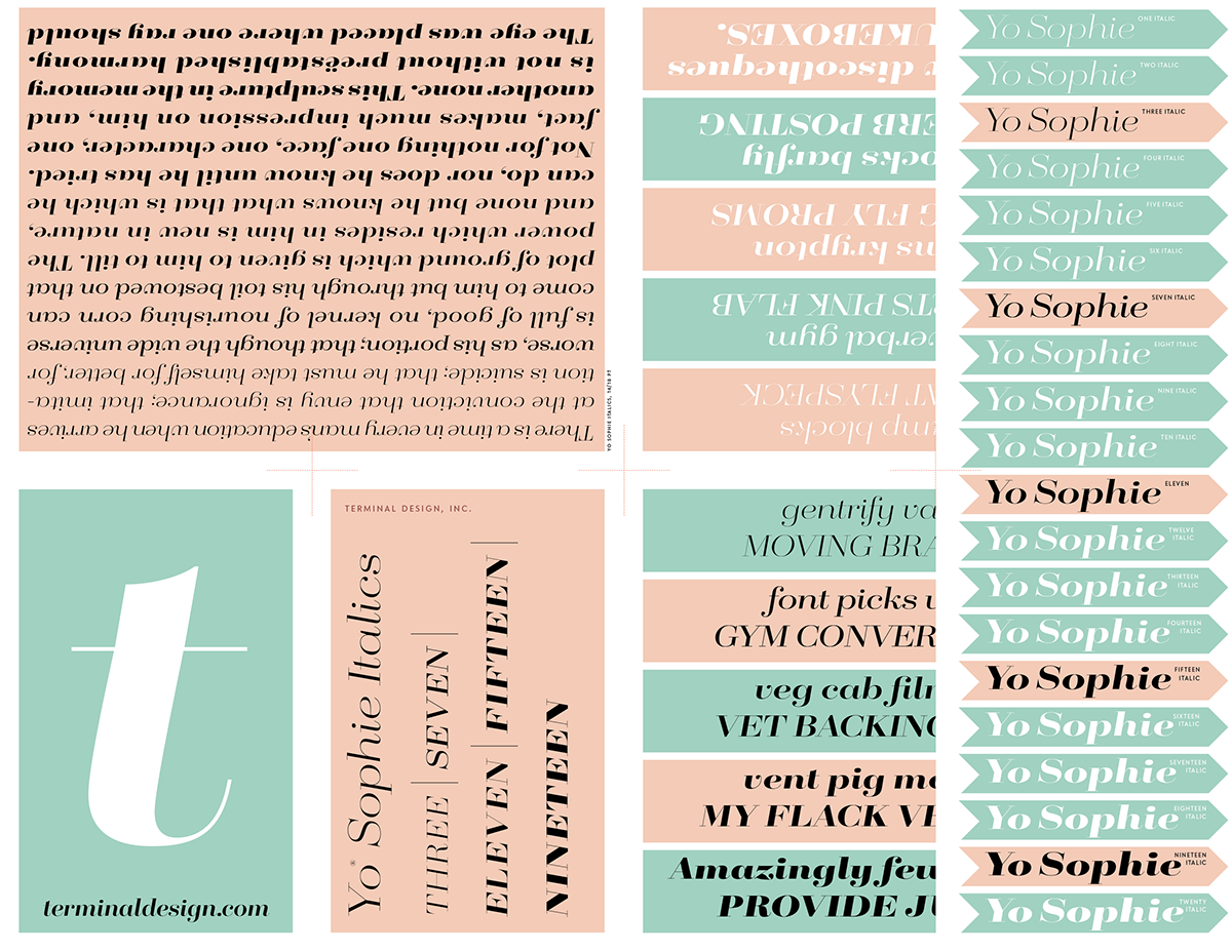
I mistakenly thought that a 100 font super-family of Didot-like fonts would be enough. I was wrong. No sooner than they were released I was inundated with requests for their italic counterparts. The italics have been added and now that 100 font super-family is now a 200 font really big super-family!


Yo Andy 20 weights with italics. 40 styles in all.


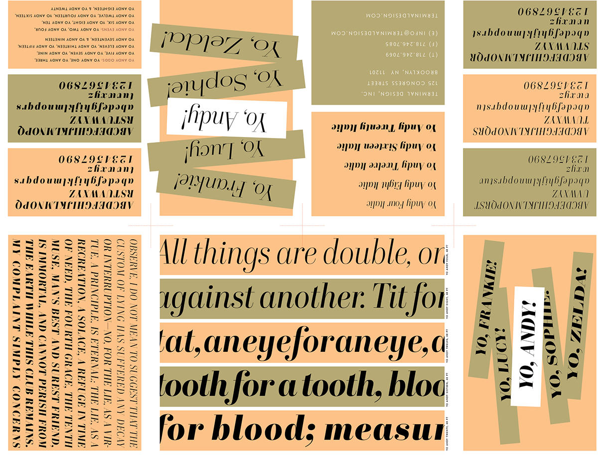
Yo Frankie 20 weights with italics. 40 styles in all.


Yo Lucy 20 weights with italics. 40 styles in all.


Yo Sophie 20 weights with italics. 40 styles in all.


Yo Zelda 20 weights with italics. 40 styles in all.